


1 min read
Business Case: The ROI of a SD-WAN solution
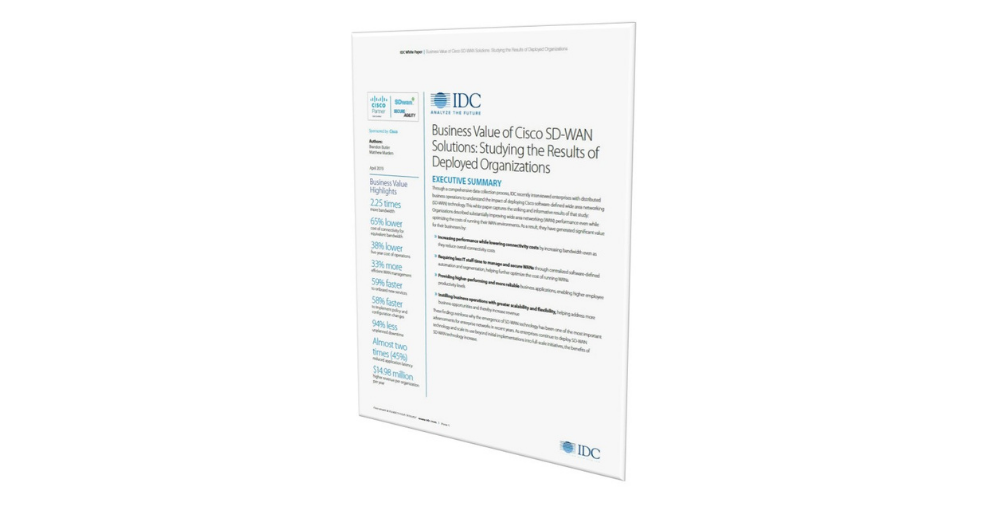
IDC reports organisations described substantially improving WAN performance even while optimising the costs of running their WAN environments. As a...
![]()
Uncover industry news and insights across End User Computing, Network, Storage and Cloud.
![]()
Practical insights and outcomes through reports, whitepapers and case studies.

![]()
Learn about our certifications, confirming our commitment to ensuring that our customer data is protected.
![]()
High-level expertise and commitment to delivering Microsoft solutions that meet our clients' needs.
![]()
We protect your privacy and handle your personal information with care and security in mind.
![]()
We protect your privacy and handle your personal information with care and security in mind.
1 min read
IDC reports organisations described substantially improving WAN performance even while optimising the costs of running their WAN environments. As a...

1 min read
Maintaining a strong security posture is a constant challenge for Australian organisations. Watch our latest webinar to see how our Managed Cyber...

1 min read
With regulatory scrutiny increasing across Australia and boards demanding stronger governance, compliance can no longer be handled with spreadsheets...